Looking at finely edited pictures displayed online is the most satisfying part of your work, but when it comes to printing photos, the inferior quality of the print or not getting what your online work looks like can stress things out.
Both photo editing and printing are essential elements of photography, and one must have a complete knowledge of the work they do and the tools they use. Undoubtedly, Photoshop is one of the best software tools for delivering high-quality, flawless image output for printing photos.
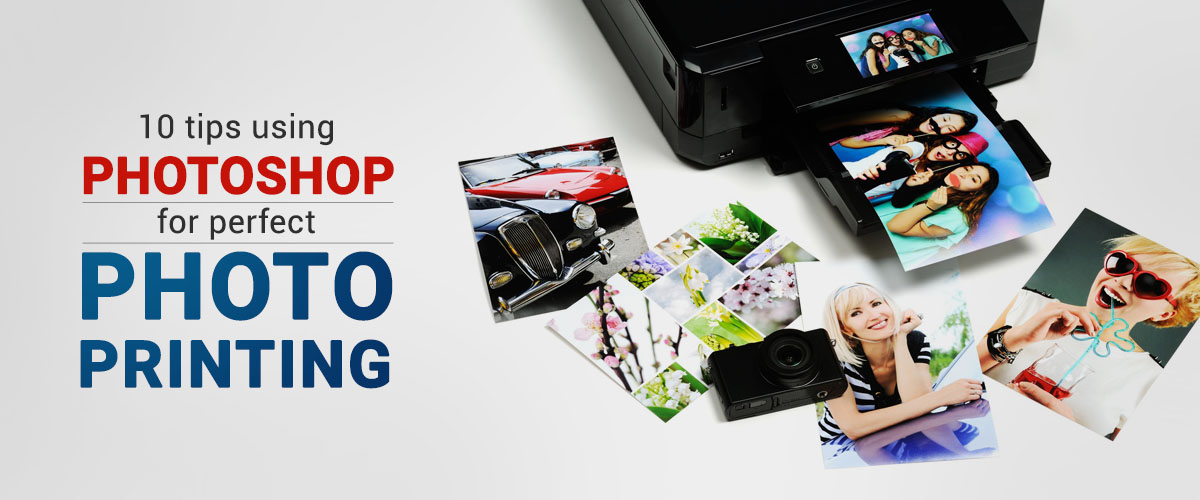
We have listed the best print settings for Photoshop in this article. By following the below photo editing tips, you can improve the quality of the output by a considerable margin.
-
Calibrate Monitor
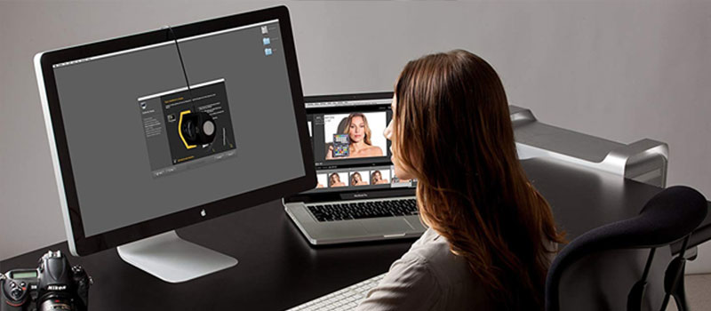
When it comes to photo editing and high-quality printing, the first and foremost step an editor must do is to check when it was the last time the monitor was calibrated. Why?
Monitor calibration is a process of measuring and adjusting the screen’s colors on which the editing work is done. Hence the monitor needs to match the expected standards.
To do so, measure the color using a spectrophotometer or colorimeter that hangs off your screen.
Regular calibration will ensure the colors you see on the screen while editing your photos are balanced and match the print version.
-
Save the file in sRGB or Adobe RGB
To get the best resolution for printing photos, permanently save your file in sRGB or Adobe RGB because an image that is saved in a larger color space while printing can lead to dull-looking or not up to the marked output as most of the printers can’t show the wide range of colors.
Or technically, the printer is out of gamut (colors aren’t able to be reproduced on the printer).
Adobe makes use of the exclusive decadent called sRGB color space, which becomes a vibrant choice for the perfect matching of the print results. This can be narrowed to the Adobe RGB, ideally reducing the out-of-gamut colors.
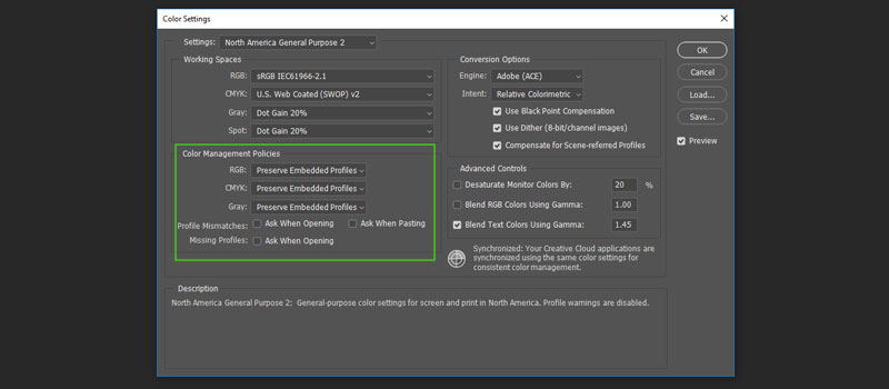
Here is the procedure-
- Edit > Color Settings.
- Choose the profile that suits the locations so that Adobe Red Green Blue can be set
- Don’t deselect the profile Mismatch boxes.
-
Always Opt for 8 bit for Image Saving
You might be aware of the term bit, and if you are not, a bit means the number of tones available for each color. An 8-bit image holds 16,000,000 colors.
But why the 8-bit image and not the 16 bit?
Well, there is no such difference when it comes to the print quality of both, but the primary reason for saving images in 8 bit is most of the printers are not accustomed to 16-bit image file formats, hence automatically switching to 8 bit while printing.
-
Save Images in 300 dpi
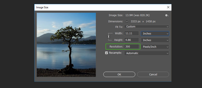
Dpi (Dots per inch) is a dot density or the number of dots printed in an inch.
It is recommended to save images at 300 dpi in Photoshop to avoid pixelated or grainy prints.
Images saved at 300 dpi look crisp and of high resolution when printed.
-
Use Standard Image Sizes
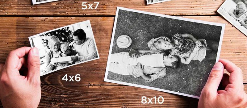
When it comes to photo print sizes, always opt for the standard ones, be it small photo prints or large photo prints.
Sizes-
- 4 x 6 inches (For framed photos, greetings cards, and postcards)
- 5 x 7 inches (Slightly larger size for framed photos, greetings cards, etc.)
- 8 x 10 inches (A perfect size for most impactful photos)
- 5 x 11 inches (for posters or large prints)
- 12 x 18 inches (For large photo prints)
- 18 x 24 inches (For large and high resolution)
- 24 x 36 inches (For an extra-large print)
-
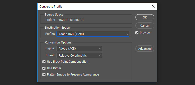
Embedded Profile Conversion
After the file is ready to be printed, identify and analyze the color profile, and you will find that it uses the monitor-friendly sRGB color space. An option to convert the document’s colors to the working space will be shown in the option. Go ahead with the same and click OK.
-
Gamut Warning
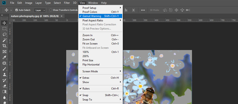
Sometimes it happens when you do both the color profile modification and profile conversion, but they still may not be acceptable for the printer from the color perspective.
In such a case you can choose View > Gamut Warning.
When you identify the colors during the process of printing, the same will be highlighted in grey patches. The Color saturation reduction is a best used technique which can be easily accessed with a vibrance adjustment layer. The output will lack any grey patches, but other colors will look dull.
-
Configure Photoshop Printing Settings
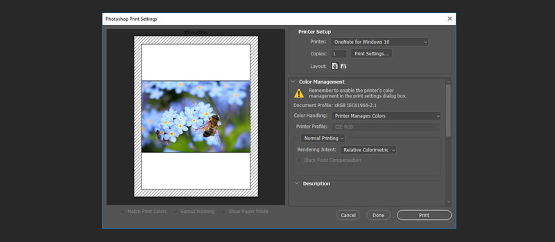
Not only the printer setting is what you need to focus on, but configuring the Photoshop printing settings is also essential.
First- Go to ‘File’ in the main navigational menu
Second- Scroll to the bottom and locate ‘Print.’
Third- If you click ‘Print,’ it’ll bring up the print settings.
Fourth- A dialog box will open, and you can configure the settings as per your need.
-
Conversion of Modes
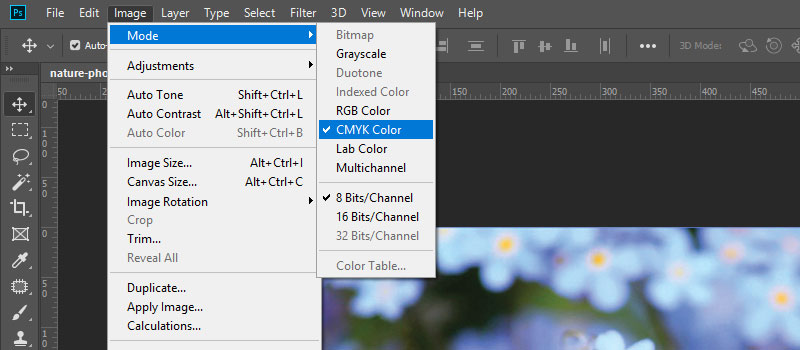
To reduce the Gamut patches, choose the CMYK (Cyan, Magenta, Yellow, and Key-black) color from the Mode menu, and your CMYK mode color space will be active.
Now go to RGB color space and see the difference between them. It is a hassle-free and efficient process to convert RGB to CMYK with Photoshop.
-
Vibrance Adjustment for Final Touch
You can also use the vibrance adjustment layer, this feature helps in improving saturation; always note there are no production warnings whenever you go for printing.
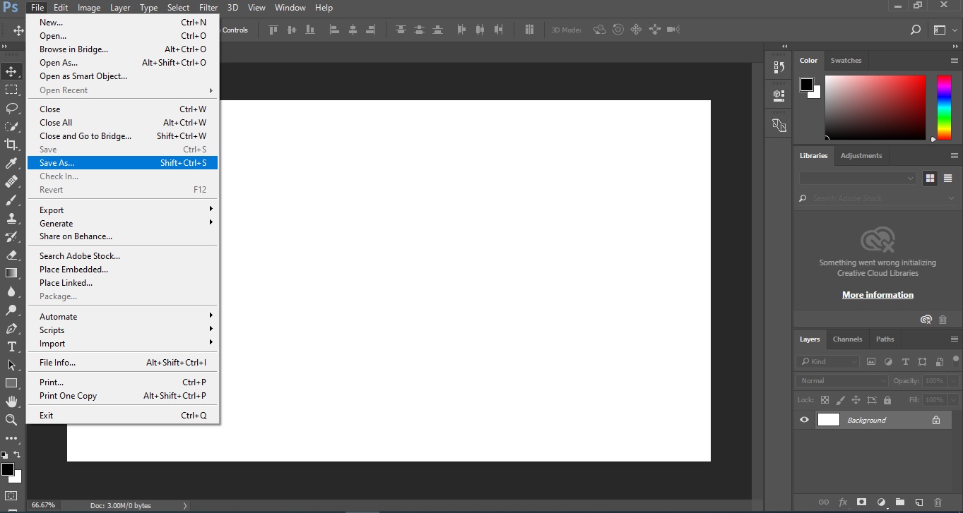
How to export a file for printing in Photoshop?
To export your completed file for printing go to “File” menu and choose “Save As” option. Short cut for saving the file for printing Shift + Ctrl + S (Windows) and for Mac Shift + ⌘ Command + S. Best format for printing a file in Photoshop will be PDF. Most of the printing companies will prefer PDF file format for printing.
Frequently Asked Questions
To conclude
These are some of the best photo printing tips for Photoshop; these tips will surely come in handy when you have to print pictures without compromising the details and the look & feel.
Visit our graphic design articles section to find more interesting tips and tricks related to creative designs.