Projects can be seamlessly represented through PowerPoint. It is an easy and powerful tool for presenting various topics. With palatable visuals, it can engage the attention of the viewers. From the visual impact on collaboration, effective PowerPoint presentations have a number of positive attributes.
Speaking of visual impact, you can make your presentation inviting through the use of multimedia. It improves the focus of the audience. Images, video, and audio can be used on this platform to enhance the overall experience of the audience. PowerPoint also enables people to work in a collaborative manner, especially when they are doing teamwork. It enables multiple people to contribute to the presentation. It also provides facilities to leave notes for other team members. Apart from these, one can also comment if necessary and it will result in better clarification.
Sharing of content becomes easy when you use PowerPoint. People can upload the PowerPoint slides on YouTube with all relevant elements like commentary and translations. It is easy to execute the processes and it eases up the overall process of functioning. The tool is flexible in nature. You can communicate with your audience in a number of flexible ways when you use custom PowerPoint presentations. These slides are customizable and you are free to incorporate the right mix of texts and images in the slides. If you are delivering a lecture, you can opt for a text-heavy PPT, so that the others can take notes. If you are demonstrating something based on visuals in a conversational style, you can use an image-heavy PPT. A combination of the two also works out well.
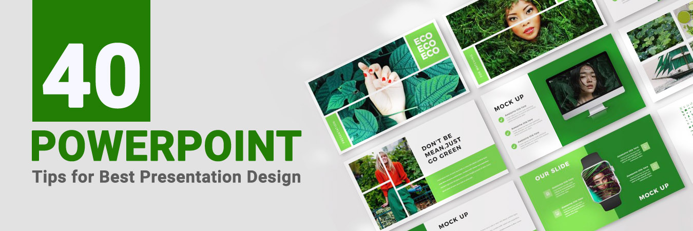
Certain factors differentiate a good PPT from a dull and uninteresting one. The speech and elements in the presentation should complement each other. Even if the speech is good, a poor quality visual may diminish the effect of the message. Both the content and design of the presentation have to be superb. Here are 40 tips that will help you to craft engaging presentation slides in PowerPoint, enabling you to get the message across in the right way.
- Plan how to present your stuff
- Learn about your audience
- Do not use the stock template
- Use six of lesser number of lines of text
- Do not use bullet points
- Incorporate Sans Serif Fonts
- Use the right font size
- Use contrasting colors for the background and text
- Align the objects properly
- Avoid the sound effects
- Don’t use clip art
- Add animations
- Incorporate videos
- Try using Presenter Views
- Embed websites or webpages
- Create custom shapes in slides
- Do not go for more than 5 colour variations
- Draw attention by using contrasting text colors
- Usage of Single Image
- Enhance emotional appeal by including visuals
- Freeze transitions in the presentation
- Background images are the base
- Replace boring lists with icons
- Pour creative juices into the cover slide
- Add a pinch of humor
- Keep the slides spacious
- Be simple- people hate complex things, at least complex presentations
- Maintain a conversational tone
- Use a readable and standard font
- Illustrations are better than pictures
- Don’t forget branding
- Consider white fonts
- Infographics are admired
- Responsiveness is unavoidable
- Left is right
- Dedicate slides exclusively for separate ideas
- White is not boring
- Ask questions
- Get feedback.
- Maintain simplicity.
1) Plan how to present your stuff
Having complete knowledge about the topic you are going to present can help a lot while designing the best presentation. It also helps to reach your targeted audience in an effective and quick manner. Figure out all the things you want to include in the PPT and in what order it should be presented to maintain the flow and keep the viewers engaged.
2) Learn about your target audience
In order to prepare a design that is effective to serve its purpose, it is really important to understand your target audience. Keeping them in mind, you can incorporate all the things in your PowerPoint presentation that can draw and retain the attention of the audience. It also depends on a lot of factors such as choosing the topic of the presentation, the content to be added, the language for addressing the viewers, the examples used, etc.
3) Do not use the stock template
Start with a clean presentation and never use the stock or free powerpoint templates. They have already been used in thousands of slides over the years and turn out to be dull and boring. The audience will feel it uninteresting right from the outset. Therefore, you can build the presentation right from the beginning and discard the template that has been provided. It will add life to the visuals. Customizing an already existing template always has limitations.
4) Use six of lesser number of lines of text
Visual pleasure the a key to draw people’s attention. You should take necessary care to ensure that the slides are not overloaded with text. They should have substantial breathing space. The audience needs to process the matter through the visuals while you speak. Too much congestion makes readers confused and they may soon lose their interest. It is vital that the speaker and listener are on the same page during the presentation. Even the best PowerPoint designs fail when they are overcrowded.
5) Do not use bullet points
Bullet points do not make a presentation smart. Instead, they add to their complexity. It is easier to remember content presented in slides than to remember a number of bullet points. These bullet points have already been overused, so make sure that you present the information in the form of slides and not in a cluttered-up way with bullet points. This is one of the advanced PowerPoint tips.
6) Incorporate Sans Serif Fonts
Make sure that the legibility of typography is not hampered. Often, people opt for funny or complicated fonts, which reduce the legibility of the message. You can use a creative font in the title of a slide, but avoid using it in the body. Traditional typefaces like Helvetica look clean and tidy. If you incorporate a dark background in the slide, adjust the contrast and use a suitable font color.
7) Use the right font size
If you are preparing a presentation on a laptop, it might turn out to be different from the final presentation. Thus, font size is an important factor in the slides. Make the font large enough, so that even the people sitting at the back end of the room or hall can easily read them. This is something that the professional PowerPoint presentation designers never overlook.
8) Use contrasting colors for the background and text
In order to ensure a good visual experience for the audience, you need to use a contrasting background and foreground colors. If the background theme shows a lot of color variation, the text may not be visible in certain areas. Therefore, you need to choose the color wisely. If the text is not legible in certain areas, you can incorporate a stylish color-bar behind the image to enhance the degree of legibility.
9) Align the objects properly
With PowerPoint, you can effectively align all the objects in your slide to make it look professional as well as eye-catching. You can also do it manually. However, it might not be possible to arrange every object with perfection. Hence, it would be the right decision to allow PowerPoint to make the desired alignment for multiple objects with perfection to increase the appeal of your designs.
10) Avoid the sound effects
PowerPoint enables the user to add music or audio files in your presentation. However, it might end up deviating or distracting the focus of the viewers from the desired message. Therefore, it would be better to not use it or if used, you can pay special attention to ensure that it engages the audience as well as highlight your key ideas in the presentation.
11) Don’t use clip art
Instead of using clip arts, try using high-quality graphics for enhancing your presentation designs. It will make your designs look more professional. You can either create it yourself or hire companies who can deliver the same to you. Depending on the requirement, you can choose the one which suits the best for your presentation and delivers the exact message to the viewers.
12) Add animations
Adding animation to your PowerPoint slides can help in directing the focus of your viewers to the key elements. However, we advise you to use the animations carefully and sparingly in your presentations otherwise it might not be able to retain the interest of the audience. Hence, with proper use, you would be able to hold their attention as well as deliver the desired message from your PPTs.
13) Incorporate videos
You can externally link or directly embed the video files in your presentation. This will give a more professional look to your slides. PowerPoint enables the user to embed the video files in the presentation and play it without switching the windows. This feature won’t be applicable to MAC OS users as they can’t embed the multimedia files directly into their presentations. However, they might be able to do it once they make sure to save the files in WMV format.
14) Try using Presenter Views
Using the Presenter View option in PowerPoint can give a more natural and professional flow to your slide designs as well as the entire presentation. This tool can help in accentuating the appearance which also results in improved performance of your PPT.
15) Embed websites or webpages
You can directly embed a website or webpage into your PPT with the help of an HTML iframe to add more value to our presentation slides. There’s another way of incorporating the websites, i.e., by creating links. However, in case you are a MAC user, then you can embed the websites or webpages by taking screenshots and linking them through a web browser.
16) Create Custom Shapes in Slides
You can also create custom shapes in your presentation according to your requirements. There are various tools present in PowerPoint that can help you create accurate shapes which is impossible to achieve manually. Apart from this, it also allows you the option of cropping images into new shapes. This helps in making the slides more presentable to the audience.
17) Do not go for more than 5 color variations
You need to make the presentation harmonious. It should ease up the reading process of the audience, not make it difficult for them to read. Therefore, do not go for complex gradients and textures. Keep the presentation as much simple as possible. The correct use of colors can enhance the looks of the presentation. A website like Coolors or a tool like AdobeColors can help you to pick the right color combination. Do not use more than five colors in the presentation.
18) Draw attention by using contrasting text colors
You can focus on important areas of the text by using contrasting colors. However, too much color variations can make it strenuous for the eyes. Make sure that the right colors are used in the text to make it a good reading experience for the readers. Most of the companies offering PowerPoint presentation design services, professionally, consider this with huge reverence.`
19) Usage of Single Image
Images add to the visual appeal of a presentation. However, too many images in a single slide can create confusion. It is not a photo album, so use a simple image in a slide that has good compatibility with the texts.
20) Enhance emotional appeal by including visuals
Visual elements in your presentation increase the degree of comprehension and retention. They help to yield an emotional response from the audience. Strong visuals can successfully get your message across to the audience and no professional PowerPoint design companies will disagree with this fact.
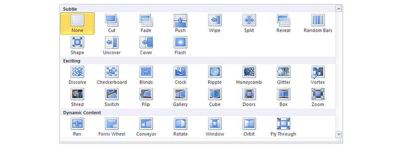
21) Freeze transitions in the presentation
A number of sophisticated transitions may be available in PowerPoint. However, it is recommended not to use these in the project, as they tend to distract the audience. Freeze the transitions to ensure unhindered lucidity of the message.
22) Background images are the base
As far as the design is concerned, the most vital part is the background upon which you put on different concepts. To attract people and make them listen, the color gradient and background image must be persuasive. Only when such a presentation is posted on social media or other platforms, you can get the intended results.
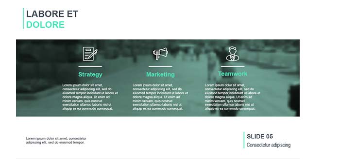
23) Replace boring lists with icons
Icons can be really helpful when you are planning to simplify some complex points. You may have to explain a broader concept in the upcoming slides but preceding it with a list will provide no means of curiosity. You don’t want that to happen! So, icons are always a better choice to make.
24) Pour creative juices into the cover slide
Most of the amazing PowerPoint presentations always have one thing in common- great cover slides. Though not mandatory, it is always better to create a cover slide that captures the essence of your message in a creative manner. There are no stiff rules to follow. You can experiment and avoid the text-only thing. Put some icons, get some illustrations and try to make a bold statement.
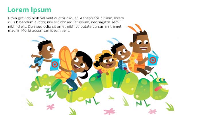
25) Add a pinch of humor
Who told business presentations that are that serious? Your prospects are human beings and not emotionless corporate drones. Adding some fun-filled illustrations diplomatically and strategically can help you gain trust by inducing emotional responses. Making people listen and respond is what matters; rules matter less.
26) Keep the slides spacious
It is always recommended to have some breathing space in your PowerPoint slides. Adding a lot of details and making the slide crowded will distract and even frustrate your audience. So, if you are using any charts, tables, pictorial representations or graphs, try to use not more than one in a slide.
27) Be simple- people hate complex things, at least complex presentations
Keep the light of the ideas and don’t make the slides too stuffy and vibrant. Staying simpler in your presentation will convey ideas clearly and with more clarity. If you use too complex features and figures, an audience would never appreciate that. So, the best PPT design is not always the intense usage of complete software features
28) Maintain a conversational tone
Throughout the presentation, maintaining a warmer tone that communicates with people on a not-too-formal note is advisable. If they feel a more personalized approach, they would be keener to stride with the flow of your presentation. Also, people feel valued when you personalize the communication.
29) Use a readable and standard font
After delivering, you may not know where the PPT is going to be presented. It may be in a small conference room; it could also be on a huger platform. So, you have to make sure that regardless of where the presentation is given, the audience can see the text. Readability is important and hence, font selection is something you should do with great care. Avoid fancy fonts unless you are trying to sell toys, chocolates or barbies.
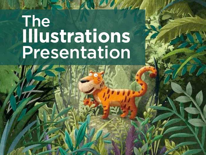
30) Illustrations are better than pictures
When you use pictures, maintaining consistency is a challenge as finding similar images can be troublesome. Lack of consistency may make people give more attention to pictures. However, illustrations can be created with the help of professional companies using certain elements of similarity and hence they are more recommended. The focus stays on content while the illustrations make the whole visual appeal to the targets.
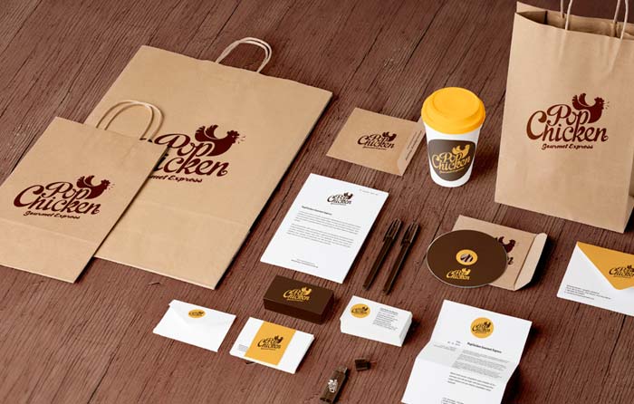
31) Don’t forget branding
Amid all the efforts you take to design your great business presentation templates, there is one thing that you should not forget- the branding part. Include the logo or something with which people can connect to your brand. Presentations are shared and you never know how many dimensions it would have.
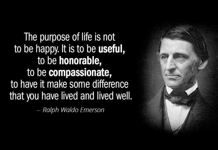
32) Consider white fonts
If you have something really significant or a quote to display, there is an option to make use of white fonts. Such text can be put on an image. White fonts on any image get noticed quickly and also make it easier to read.
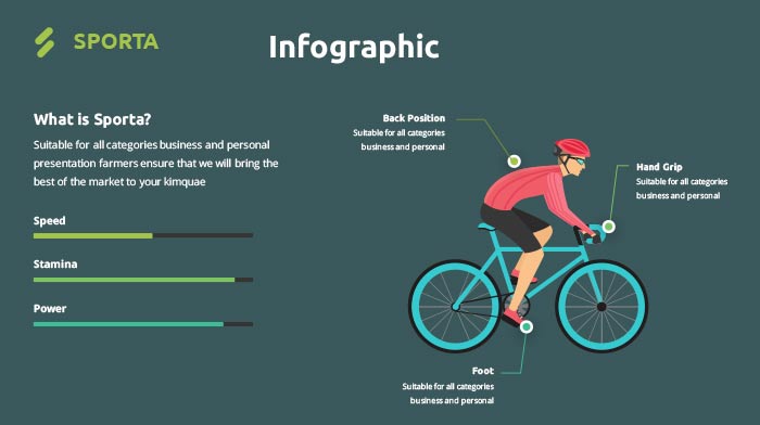
33) Infographics are admired
If you make smart use of style, spacing, and layout, the same images can be converted into an infographic. By doing so, you can enjoy the advantage of generating two separate and unique content piece.
34) Responsiveness is unavoidable
Almost everyone has a smartphone nowadays and chances are high that your presentation may be viewed on multiple handheld devices. In such a scenario, you have to make sure of responsiveness.
35) Left is right
How you align the text is also very important. Reading habits must be taken into consideration for text placement. As a general rule, it is always better to keep the text left-aligned. People usually start reading from the top left end. Well! If grabbing the viewer’s attention suddenly is what you are looking for, in between you can violate this.
36) Dedicate slides exclusively for separate ideas
Never clutter a slide with many ideas; it can confuse and distract the audience. Putting a chunk of text with bunches of ideas on a single slide is something worse you can do to a professional presentation. If you want to explain further, step on to the next slide and expand the concept.
37) White is not boring
There is a common misconception that white background in a presentation makes the whole PPT lifeless and boring. So, most of the people add images and colors to the slides. There is no harm in it but completely staying reluctant to white is never a good practice. In fact for certain niches, white is one of the best colors on which you can rely for a PowerPoint presentation.
38) Ask questions
As far as a PPT is concerned, asking questions to the audience may not be always used to get answers. By putting in some questions, you can make the audience think and retain their attention and interest. This is what you exactly need.
39) Get feedback.
Consult a friend. Show him/her your presentation and ask for feedback. Who knows? He/she might help you discover something unique.
40) Maintain simplicity.
Less is more and this is very much true for PowerPoint presentations. You should make sure that your slides do not look cluttered and that you put focus on the main points. This would keep your audience’s attention in track, allowing you to put your message across easily.
The above-mentioned tips and tricks can help you significantly if implemented strategically. However, decide the nature of your presentation based on the target audience and purpose.
Professional Features to make your PPT presentation to stand out
PowerPoint is the global standard for creating compelling presentations. However, a presentation can be simple and drab or engaging and visually appealing. The difference lies in how effectively you leverage the potential of this application to add magnetism to your presentations. Let see some pro tricks that when incorporated in your PowerPoint presentation would add a ‘wow’ effect to it.
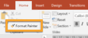
1) Improve your productivity with Format Painter
In the Home tab of PowerPoint ribbon, you would come across ‘Format Painter’ command just beneath ‘Home’ represented by a brush icon. Using this, you can optimize your time. The process of copying and redoing the format of a particular element or group of elements on a particular slide to other elements on the same slide or other slides can be a demanding task. The amount of time consumed would take its toll on your productivity.
If you have to copy the format of any element(s) manually, you need to keep in mind all the settings you had applied. As you go about formatting other elements, you have to meticulously apply the settings without missing any designing aspect. If a particular aspect is not copied, the entire theme goes awry. You can avoid all these hassles and also save time by using Format Painter.
To use Format Painter, you need to follow these steps:
- Click on the slide element whose format you want to copy
- Click the Format Painter icon or Ctrl+Shift+C or Ctrl+Shift+V keyboard shortcuts
- Click on the element/ elements on which you want to apply or paint the same format
- The formatting would be automatically copied instantly to all selected elements
If the formatting has to be applied on more than one element, you have to double click the Format Painter icon. Next, go on clicking every element one after another for applying the format. After the formatting of all elements has been completed, you just need to press Esc button on the keyboard. That’s it.
2) Employ Flowchart Animation for Displaying Complex Information
The information which is complex in nature is often presented in easy to comprehend structure with the flowchart. Displaying the complete flowchart in a single go may not serve your purpose and leave audiences confused. To facilitate a more participative discussion, each aspect of the flowchart has to appear at a time when the underlying point deserves attention. This can be pulled off with flowchart animation.
For animating your flowchart on the slide, you just have to follow these steps:
- Prepare your flowchart with all the elements
- Click on the first element or box from which you want to automate the process
- Navigate to the Animations tab and choose an entrance animation that suits your scheme
- Go about setting the animation type and timing for each element
- Animation settings can be viewed and adjusted from the Animations Pane also
- Once you have set the animation scheme for all elements of the flowchart, preview it
- Carry out any editing as you deem suitable to make the flowchart more interactive
3) Use the Zoom Feature in Office 365 to seamlessly move among slides and sections
The latest version of MS Office is Office 365 which can be accessed on the go from the cloud. If you have subscribed to Office 365, you can access the new Zoom option in the most recent PowerPoint version. It is available under the Insert tab. The Zoom option is available in 3 choices i.e. Summary Zoom, Section Zoom, and Slide Zoom.
With the Zoom feature, you can hop among or switch between sections or slides. Suppose, you have to navigate to Slide 40 and you are presently in Slide 2. With earlier PowerPoint versions, you have to key through each slide or switch to the slide sorter option and then select Slide 40. These hassles have been done away with Zoom feature through which you can instantly switch to Slide 40. The interest of the audience would also be sustained.
You just need to plan at the start which slide would follow a given slide so that you can go directly to it by skipping others. Just like ‘Table of Contents’, Zoom provides a new feature called Summary Zoom. The summary slide carries a snapshot of all slides that are there in the presentation. It can be placed anywhere in any order along the presentation’s body.
With Section Zoom, you can move from one section to another. The Slide Zoom facilitates jumping to any desired slide within the presentation.
4) Make slides more animated with video background
To make your presentation more engaging, you can use a relevant video as the background of the slide instead of an image. For using PPT video background, you need to
- Select the desired video for dragging and dropping the same on the slide
- Resize the video to ensure that complete slide is covered
- Ensure that the video would play back until the discussion regarding the slide’s content is over
- Loop videos whose length are short
- Click on the video for making ‘Video Format’ menu to appear
- Click on the Playback tab and check the ‘Loop Until Stopped’ option
With the video playing in the slide’s background, any shape or text or presentation element can be added to the foreground. You can use any stock video available freely over the internet or can engage a professional agency to create one.
5) Save time by applying global changes to all slides in one go
If you edit slides singularly, you have to devote a significant amount of time. You can, however, save time by making global changes which apply to all slides in the presentation.
These steps can help you implement changes at one go:
- For changing the look of a complete presentation, navigate to the Design Tab
- In the Themes section, choose any theme from available ones and apply
- In the Designs tab, move to the Variants section next
- Here, you can access the color and font settings from the dropdown menu
- Colors and fonts of the theme can be selected as per presentations overall style quotient
- You can customize the fonts and colors and use various settings
- Once you arrive at the best look for your presentation, you can apply it globally
- You can insert elements that would be visible across all slides from Slide Master option in View Tab
- Elements can be the company’s logo, an address of website, date, time, brand’s tagline, etc. etc.
- You can insert slide master or layout as well as other elements you want
- Once done, you have to click the Close Master View on the View tab to experience the changes
6) Preserve the integrity of custom fonts by embedding them in the presentation
If you are using fonts in PowerPoint which are branded or customized, you need to ensure that the same is installed in the computer in which the final presentation would run. If the stylized fonts aren’t installed in the computer, PowerPoint would replace custom fonts with default ones which would ruin the content alignment and the aesthetic feel of your presentation.
7) Use unique icons created by you within PowerPoint
If you have subscribed to Office 365, icons can be inserted right from the submenu ribbon in PowerPoint. You would come across innumerable free icons under Icons in Insert tab.
However, if you want to create unique icons which reflect your creative trait, you can do so using Shapes under Insert tab in PowerPoint.
From Shapes, you can insert any shape that you want. If you have opted for a number of shapes, selecting the same would make Drawing Tools tab to appear. You can avail of the Merge Shapes feature which allows ‘Union, Combine, Fragment, Intersect and Subtract’ operations. Make your creative juices flow with these options. Causing different shapes to fuse or dissolve out would help the creation of original icons which can be collected into a library for regular use.
8) Make different images on the same slide behave like a SmartArt graphics
If you have inserted different images on a single slide, you would find it difficult to move, reshape, resize or edit each image individually by hand. However, PowerPoint offers a way out.
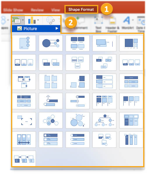
By pressing Ctrl + A on the keyboard, you can select all the images on the slide. Once selected, the Picture Tools menu becomes visible on the Format Tab. Click on Picture Layout under Format to get access to a large number of layouts to choose from. Once you have chosen your format, the images would be converted into SmartArt graphical form. The images can now be rearranged but they would behave as a SmartArt graphic only.
If you are not comfortable with the SmartArt feature, you can convert the graphic back into individual images from the SmartArt Tools which appears by clicking on the graphic. You just need to click on ‘Convert to Shapes’ from Convert menu in the Design tab.
9) Ease the distribution of your presentation by converting it into pdf
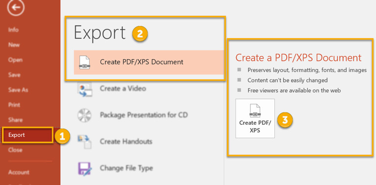
You can easily distribute your presentation in pdf format for ease of viewing and maintaining the integrity of formatted layout. The presentation can be converted into pdf from Save As option under the File tab. Just specify the location where you desire to save the pdf file and then select PDF from the Save As Type dropdown. Alternately, you can also export the presentation as pdf from ‘Create PDF/XPS Document’ under Export in File tab.
Frequently Asked Questions (FAQs)
You have to remember a few key parameters if you want to improve your PowerPoint design. First off, your PowerPoint design should be a sure-shot formula for success. It should be based on thorough research and adequate planning, which in turn would help you to deliver your message to your target audience in an appropriate manner. The slides should have illustrations and texts that would convey your messages in a cool way without creating an overwhelming effect on your target audience. You should set proper display timings of your slides so that the slides get displayed properly in front of live viewers. The presentation should have a calm and composed persona, but it should be able to generate a feel of warmth and energy among the target audience. Your slides should not only be error-free, but they should not feature unnecessary decorations such as cheesy clip-arts or flashiness. When you make a note of these criteria, you move several steps closer to improving your PowerPoint presentation.
This rule is very simple. Ideally, a presentation should feature 10 slides, have a maximum duration of 20 minutes, and feature fonts that are at least 30 points in size.
There’s no single way how you can define creativity. While there is no definite rule to create a visually-attractive presentation, there are certain tried and tested practices that yield great results. For example, over-styling is not good. Keep your presentation simple. You may use bold, italics, and color-change to make texts appear highlighted. You should choose the right images that are relevant, genuine, non-distractive, and inspirational. Use a layout that can attract the attention of the audience to specific sections. Use bullet points, phrases, or just keywords as the textual content. Using sentences in slides can make the slides appear unattractive. Apply color contrasts using colors that best complement each other.
You will need to work on a lot of details and data in order to be able to select the most relevant points that you should be including in your presentation. You should adhere to one single idea or theme throughout your presentation and include only the most pressing points. Including many elements and ideas together in a presentation might confuse your target audience. Put the concluding statement/ inference/ or the bottom line of your presentation right at the beginning of the presentation. Then you can use slides to explain the bottom line. This would promote better engagement among your target audience. Use graphs and charts in most places to explain a scenario better. Data-driven insights give audiences a better idea about a particular business case.
A standard PowerPoint template has a square shape with an aspect ratio 4:3. You would need a standard template while showcasing a presentation on an iPad or an older projector or a tablet. On the other hand, an aspect ratio of 16:9 is desirable for other types of projectors including TVs, laptops, and latest versions of overhead projectors.
Designing a presentation is not easy because it requires the designer to understand the core purpose of creating the presentation and the tastes of the target audience. Begin by creating an outline that would highlight your main points in the form of text and graphics. So you should think what you want to say through your presentation. Identify the main ideas. Identify the tone of delivering messages. Business presentations are typically boring, so a plain, simple outline is often preferred. However, depending on your target audience, you can still add a few entertaining elements in your slide. Choose a color palette with two main colors and two or three secondary colors. Use warm colors if you want your presentation to appear lively; use shades of gray and blue if you are looking to create a professional presentation. Focus on one single point per slide. This would help you to emphasize on the core idea. Include memorable visuals in your slides. Visuals, just like texts, can invoke emotions. Use simple graphics to make your ideas easily understandable. For example, use a growth graph to make your target audience understand the rate of growth that you are looking to achieve in the next five years or so.
While preparing a presentation, you should ask three main questions. What is the purpose of this presentation? Who is the target audience? Do you need to adhere to any branding philosophy? You should try to understand the objective that the presentation needs to serve. Is it a sales presentation or a presentation that is needed to portray the future growth numbers? You should understand the taste and preferences of the target audience and how the presentation needs to affect them. This would help you develop unique presentations that would resonate well with the psychologies of the target audience. Thirdly, you should develop a presentation that complies with your brand’s philosophy. This holds particularly true if you are designing a presentation for a client. Use the brand’s color themes and key messages to develop brand-specific presentations that can showcase a brand’s values effectively.
While it is very easy to avoid the most common PowerPoint mistakes, people still end up making those mistakes unknowingly. It is not a good idea to use too much text in the slides. This would kill the overall impact of the main messages that you intend to deliver. It is advised that you avoid clutter at all costs. Clubbing up of too much text and graphics may spoil the overall look of the presentation. You should avoid bad color contrasts as this would spoil the reputation of your company as well as the importance of the messages. Avoid using high-end transition effects and animations especially in business presentations as this would cause distractions and keep people away from interpreting your messages in an appropriate manner.
Conclusion
PowerPoint is a powerful, versatile and features rich platform where you can apply numerous tricks to make your life easier. The tips discussed over here would prove immensely valuable in improving the aesthetic and functional design of the presentation. Just be creative and make your audiences fall in love with your presentation skills. You can also seek the assistance of renowned companies like PGBS which has many experts and experienced PowerPoint gurus on its rolls. All the help you would need to create an awesome presentation would be forthcoming from PGBS.


