Color is a critical consideration when it comes to creating a logo design and reflecting a brand’s true persona. When you choose the right color combinations, you will not only be able to make your designs more versatile and awe-inspiring, but you will also be able to establish a brand’s identity in a more desired and holistic manner.
The choice of colors is also vital to adding depth to your logo design and setting up a visual connection between the brand and its target customers. Business logo design is a complex process, and with the right color combination, you would be able to convey a brand’s messaging in the most appropriate manner to its target customers.
Colors do not only add an aesthetic appeal to a logo, but they actually allow brands to connect with their customers with a deeper psychological impact. When you choose a certain set of colors while designing a logo, you should realize that you are actually targeting to invoke certain emotions among the target audience. Building a brand’s identity is highly dependent on your decision to choose the right colors to achieve a business’s branding objectives.
A logo that is designed with the right colors has the power to generate a positive customer response. On the other hand, the use of inappropriate colors may prove to be a major impediment to building a positive brand image. With research suggesting that our brains react in different ways to different colors, you, as a logo designer, might be interested in understanding how you can use specific colors to invoke specific emotions in people and the emotions that each color can generate in people so as to be able to create a stronger brand value that would hit people’s psychology on a positive note.
However, you should note that understanding how colors impact people’s psychology is a complex task, and so you would need to practice prudence in order to be able to judge the right color schemes for your latest logo design project so as to be able to create a perfect company logo design.
Choosing Appropriate Logo Colors by Understanding Color Psychology
We can define color psychology as a study of colors and how they impact human behavior. Color psychology is a critical consideration in branding and marketing-related decisions, and brands and their design teams should have a thorough understanding of color psychology so that they can use the right colors to create logos and other visuals that are meant to help them curve out a distinct identity in the market.
Color psychology has been studied for ages, and with time, the studies have evolved to become more focused and insightful. And this has allowed businesses to make optimal use of the findings and strengthen their brand appeal further. Color psychology rules have remained the same over the years, and businesses can apply these rules to create stunning logos and other brand visuals.
Useful Article: How to Choose an Effective Logo for Your Business (Useful Guide)
This article guides readers on the effective use of logo colors, helping them to understand color psychology well and apply the rules properly in their creations.
Understand what each color portrays and how you can play around with colors to create a strong brand image and win the confidence of the target audience.
Red
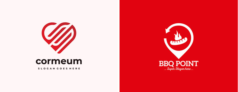
Red symbolizes strong emotions such as passion, love, romance, excitement, vigor, and anger and it is one of the primary colors. It is one of the most popular colors, which is widely used for establishing memorable brand identities. Red is your ideal color if you are looking to establish a loud brand image and incorporate elements of youth, playfulness, and vigor in it. However, if you are looking to create a modest logo and instill a conservative look, you should not include red in your color palette.
White

White color is noted for its neutral appeal because of which its importance often gets ignored or overlooked. White is often used as a secondary color to generate contrast and can be used effectively to create a cleaner background for a logo. White symbolizes insightfulness, efficiency, purity, and elegance. If you are working with a brand that is looking to put forward a message of luxury and distinctiveness, you would find white to be your most preferred choice.
Yellow
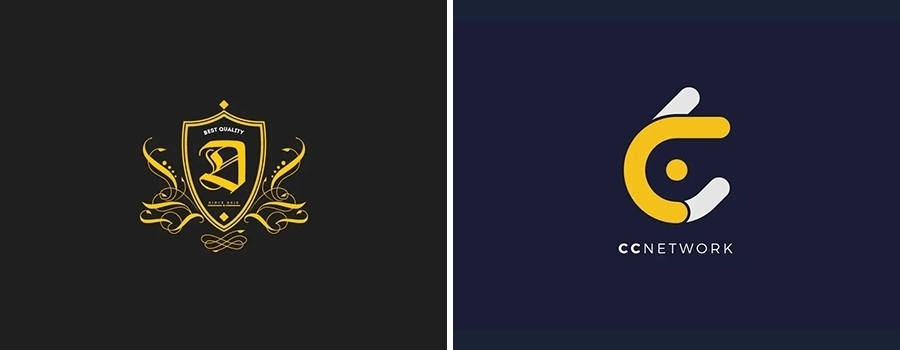
Yellow represents warmth, friendliness, and optimism. Yellow should be your choice if you are looking to instill a feel of comfort and playful energy in a brand. Yellow also signifies approachability and so by using yellow in a logo, you can make a brand appear closer to the target audience.
Orange

You may refer to orange as a close cousin of yellow because of its energetic and playful appeal. The reason why orange adds a vibrant appeal to designs is that it combines the milder tones of yellow with the revitalizing appeal of red. If you are working on a logo design project for a travel company, orange can be your best bait. Orange denotes vitality and happiness and can be considered as a balanced combination of red’s aggressiveness and yellow’s friendliness.
Purple
If you are developing a logo for a brand that stands for sophistication and luxury, purple should be in your color palette among other colors. Purple is noted for its royal appeal and gives designers a grand opportunity to utilize the powerful appeal of purple to create a luxurious brand appeal. High-end retailers and cosmetic brands apply different shades of purple to create stronger brand identities. Brands should ideally opt for lighter shades of purple if they are looking to instill a down-to-earth feel in their logos and overall brand image.
Green
Green is a soothing color that is restful for the eye. Green has a healing effect and establishes a connection with the nature. It carries a feel of balance and calmness and allows people to experience a relaxing effect. Green denotes fresh beginnings, but does not boast the energy-packed appeal of warm, vibrant colors and so it is not good for logos that are meant to represent brands with bolder statements.
Blue

Blue invokes the feelings of calmness, coolness, and spiritual awakening. Blue is also associated with a feeling of trust and hope. If you are designing a logo for a healthcare or medical brand, blue is your most appropriate choice as it promotes a feel of healing and calmness. If you are designing a logo for a corporate brand, you may want to choose a deeper shade of blue to instill a feel of professionalism and trust. Make sure that you are not overusing this color. Otherwise, you would end up making the brand appear cold and detached.
Brown
Brown promotes a feel of seriousness without being too much ‘imposing’ just like the stronger, darker tones of black. It establishes a strong connection with the natural shades because of which it appears to be so much grounded and modest. If you want to instill a feel of supportiveness and dependability, then brown should be your ideal option. Brown establishes a connection with the nature while instilling a feel of ruggedness that’s mixed with hints of warmth.
Pink
Pink is often associated with a feminine outlook and diverse shades of pink can be used creatively to promote different brand values. Pink, being a lighter shade of red, combines red’s vibrant aura and cheerfulness with its own unique calm appeal. Sometimes, pink is associated with romance and sensuousness. It has a nurturing appeal that sends out a message of feminine charm. So if you are looking to promote a brand that sells items for women, you may consider using different shades of pink to build a stronger brand appeal.
Gray

Gray is neutral in its appeal, which means that you can use it the way you like. Gray denotes timelessness, practicality, and lack of prejudice. Gray is generally used as a neutral background for bolder colors. However, depending on the brand’s persona, you may choose to keep gray as the leading color of the logo.
Black
Even though black is considered to be an absence of colors, you can still use black as a strong, dominant color for branding. Black denotes ‘significance’ and professionalism and can also be used to imply a feel of grace, substance, gorgeousness, and power. Black is your color if you are working with a brand that is looking to convey a powerful statement and establish authority and respectability.
Tips to choose a best logo color
So what are the factors that you should take into consideration while deciding on a color scheme? Here’s what you should make a note of:
- What message would you wish your business to convey? What are the qualities that you would want to highlight? Compassion, boldness, efficiency, insightfulness? Your logo’s color scheme would depend on the answers to these questions.
- What traits define your brand’s personality? Do you know that consumers buy products that subconsciously or consciously relate to their personal characteristics? Consumers categorize products in terms of colors and select the ones that best suit their own traits.
- Once you become aware of the brand-traits that you would like to highlight, you may check the color psychology rules one more time to identify the most appropriate color scheme.
Important Note: You may choose multiple colors for your logo
Don’t limit your choice to a single color. You can use a multi-colored theme to represent a brand’s traits. You can add an element of uniqueness by choosing two or more specific colors.
We would advise you to play around with colors before you settle with a final design. This would allow you to find out what actually works. Once you create a logo design, try to figure out how it would appear in different colors. Get fresh pairs of eyes to review your designs and ask for feedback.
Importance of Color in Logo Design
Colors are one of the important aspects of logo design. These are as important as choosing your brand name and contribute to a company’s success. Even so, the importance of color is often paid less attention by the companies.
Logos are the first thing that comes to the mind of people when they think about your brand. Those logos comprise of colors, which play a great role in setting impression in our minds.
Colors can affect our emotions, and with the right use, you can increase the effectiveness of your branding activities. Besides, it can even persuade customers to buy a particular product or service.
10 Best Color Combinations
The combination of colors can impact a lot of things. It includes attraction, readability, eye-strain, etc. Furthermore, choosing the best color combination will not just be useful for logo design but can also improve your print ads, website pages, and marketing media.
Since the article is basically about the use of colors for logos, let us discuss the best two-color combinations that you can use.
1) Red and Yellow
It is overall a bold combination and projects an energetic and happy vibe. The vibrant color combination is often used by famous food brands like Pizza Hut, Lay’s chips, McDonald’s, etc.

2. Red and White
This is an attractive and highly visible combination. The furriness of the red is taken by the calmness of the white. Target and Coca-Cola use this combination for their logos.
3. Blue and Yellow
This color pairing is relaxed, soft, as well as striking. These combinations radiate an upbeat and friendly feel. Visa, Ikea, and Walmart are some of the companies using this combination.

4. White and Purple
Purple alone can be a bit gloomy. But, with white, you can minimize the gloomy effect and add cheerfulness. This pairing expresses wonder and creativity. A few brands using it are Yahoo, Cadbury, etc.

5. Cream and Green
The cream and green colors create a calming and soothing effect. It is often used by natural cosmetics brands to express their purity and eco-friendliness. For example, Sukin.
6. White and Blue
This combination is perfect for business logos. It is professional and may garner trust from your audience. For example, The United States, LinkedIn, Skype, Twitter, Facebook, etc.

7. Orange and Blue
Despite the colors being complementary, it still expresses a feeling of trust, confidence, and excitement. Nick Jr uses this pairing to make its logo pleasing for both kids and parents. It is also used by sports teams like New York Knicks and New York Mets.
8. Black and White
This highly contrasting color combination will give a sophisticated and bold look to your logos. It is widely used by the style brands like Chanel, Gucci, and Vogue.
9. Pink and White
This sweet and soft combination is great for brands who wish to express something lovable and playful. It is often used for women and young girls. For example, Cosmopolitan and Barbie.
10. Black and Yellow
This pairing can help in creating a strong and powerful presence. The color combination is used by the Batman franchise and Caterpillar Inc.
So what would you choose?
At the end of the day, it’s up to you to decide what colors you would choose to portray a brand’s persona in the most appropriate manner. During a business logo design process, you should carefully evaluate what each color conveys about your brand. Do they reflect the brand’s values the way they are expected to do? When you choose the right combination of colors, you would be able to communicate the brand’s message in the most effective manner. Experienced and passionate logo designers would try to find answers to these two basic questions-“What are the emotions that you are trying to invoke in your target audience?” and “What type of customer response are you trying to generate?” Whether you are a freelancing logo designer who is new to this field or an experienced graphic artist working in a professional logo design company, your objective would be to maintain a stronghold in the industry with logo designs that just do not create wow effects, but inspire others for a long term.
Other Related Articles


