Marketing is pivotal for the growth and every business and it increases and reinforces your brand awareness in the market. When it comes to online media, the role played by banner ads should never be overlooked.
After your copywriter has provided you with an awesome copy, the next step for you is to get a design for the banner ad that allures your prospects to make clicks. The below guidelines from us can really be helpful as we have years of experience in serving customers worldwide as a reliable outsourcing company in India.
1) Take care of the banner size
The size of the banners you choose is significant. It can, in fact, determine your success. Use standard sizes that are most effective. Some of them are
Standard Banner Sizes
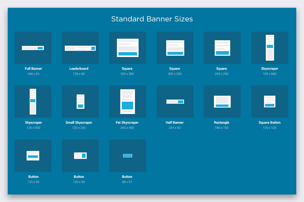
- Full Banner : 468 W x 60 H (px)
- Leaderboard: 728 W x 90 H (px)
- Square: 336 W x 280 H (px)
- Square: 300 W x250 H (px)
- Square: 250 W x 250 H (px)
- Skyscraper: 160 W x 600 H (px)
- Skyscraper: 120 W x 600 H (px)
- Small Skyscraper: 120 W x 240 H (px)
- Fat Skyscraper: 240 W x 400 H (px)
- Half Banner: 234 W x 60 H (px)
- Rectangle: 180 W x 150 H (px)
- Square Button: 125 W x 125 H (px)
- Button: 120 W x 90 H (px)
- Button: 120 W x 60 H (px)
- Button: 88 W x 31 H (px)
Common Non-Standard Banner Sizes
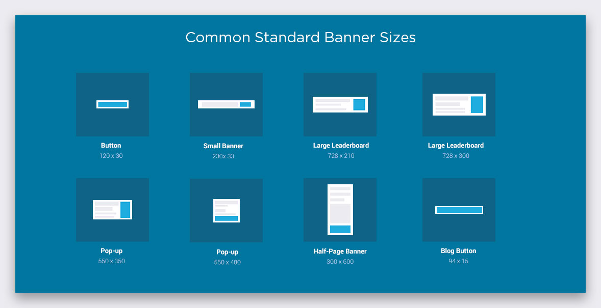
- Button: 120 W x 30 H (px)
- Small Banner: 230 W x 33 H (px)
- Large Leaderboard: 728 W x 210 H (px)
- Large Leaderboard: 720 W x 300 H (px)
- Pop-up: 500 W x 350 H (px)
- Pop-up: 550 W x 480 H (px)
- Half Page Banner: 300 W x 600 H (px)
- Blog Button: 94 W x 15 H (px)
Adwords Banner Sizes
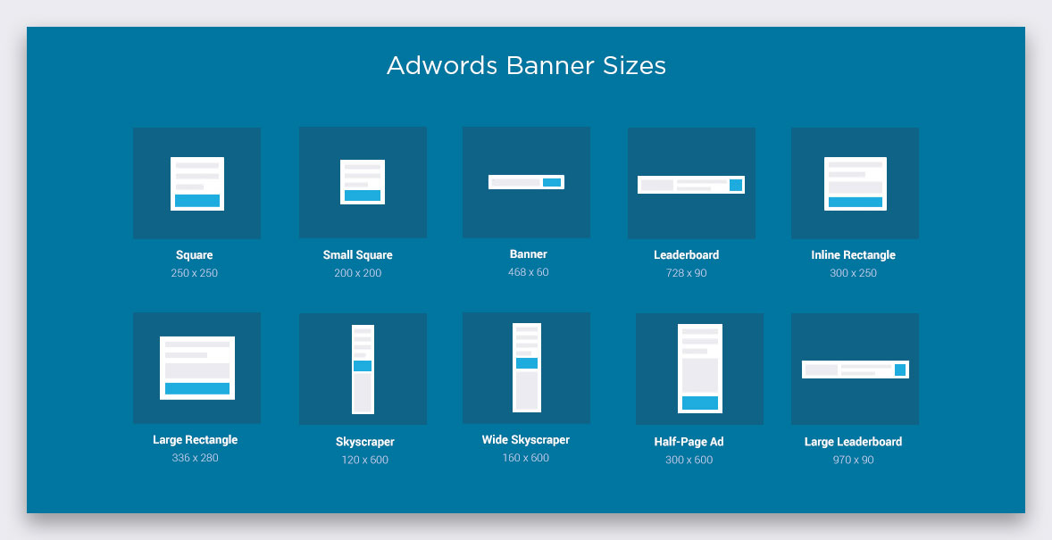
- Square: 250 W x 250 H (px)
- Small Square: 200 W x 200 H (px)
- Banner: 468 W x 60 H (px)
- Leaderboard: 728 W x 90 H (px)
- Inline Rectangle: 300 W x 250 H (px)
- Large Rectangle: 336 W x 280 H (px)
- Skyscraper: 120 W x 600 H (px)
- Wide Skyscraper: 160 W x 600 H (px)
- Half-Page Ad: 300 W x 600 H (px)
- Large Leaderboard: 970 W x 90 H (px)
Social Media Banner Sizes
- LinkedIn Personal Banner Cover: 1584 W x 396 H (px)
- LinkedIn Company Banner Cover: 1536 W x 768 H (px)
- LinkedIn Hero Banner Cover: 974 W x 330 H (px)
- Youtube Banner Cover: 2560 W x 1440 H (px)
- Twitter Banner Cover: 1500 W x 500 H (px)
- Google Plus Banner Cover: 1080 W x 608 H (px)
- Ello Banner Cover: 2560 W x 1440 H (px)
- Weibo Banner Cover: 920 W x 300 H (px)
2) Stick on to the hierarchy
You have to strike the perfect balance within every ad as per the decided hierarchy for optimizing on banner design. Banner ads that enhance awareness about your brand and direct quality traffic to your site have three important elements.
1) Logo of your company
In every banner, the logo of your company must be included to promote awareness about your brand. The logo must be clearly visible clearly but it should dominate the space as much as your call to action and unique selling proposition.
2) USP or Unique Selling Proposition
USP underlines the value that you intend to offer to customers through your brand’s product or service. To inspire prospects to commit their attention to your brand, you may include
- Attractive discounts like 20% off on sale price
- Stimulating words like ‘Best quality’, ‘world class’ etc.
- Deal closing offers like ‘Stocks limited’, or ‘Limited Time Sale’
The USP must occupy the bulk of banner ad’s space and must be prominent enough to arrest viewer’s attention.
3) The call to action (CTA)
CTA is that section of the banner where the prospect is invited to make a decision in your brand’s favor by clicking a button or textual content which would take him/her to your site. The CTA must be clearly spelled out with short text like ‘Start Here’, ‘Get it now’, ‘Learn More’ etc.
3) Buttons are to be placed properly
It is important to place the button appropriately for increasing the CTR or Click-through rate. Place them at the end of the copy towards the lower side right end in attractively contrasting colors. It should look consistent throughout.
4) There should be clearly defined frames
Subject within a frame grabs eyeballs naturally and all prominent companies in India offering banner design services agree to this fact. So, assure that the banner ads you put have accurate and properly distinguishable frames.
5) Readability must be there
All your efforts will go futile if the copy is written is not readable or hard to read. The headline and the content succeeding it should be in different sizes. Never user script, cursive or very thin fonts. Uppercase letters and too smaller fonts can also hinder readability.
6) File format should be correct and size should be small
The working deliverables are more likely to be Adobe flash files GIF, JPG or PNG. You will have to work on Photoshop, Flash or Adobe Illustrator to create them. You must remember that it is advisable to provide the banner in GIF format as they are not supported by all devices. The size of files should be not more than 150 kb as per Google Ad-words. The ad must load fast so that the visitors view it before the web page is scrolled down.
Most of the companies specializing in banner design service and offering Google Adwords banner support will optimize images accordingly.
7) Use adequate colors
The whole impact created by a banner ad depends hugely on the color you use. An expert Indian company offering banner ad designing services knows which color will suit your requirement the most and work accordingly; they are adept at color psychology. You can always instill a sense of urgency by using divergent and bold colors. Advertisements in web need not be subtle.
- Red: Red reflects angry, passionate, exciting or lovely moods. Audiences often are attracted to this color. Red, however, must be used in a controlled manner. Red must be avoided if you want to give the banner a demure, classic or sober feel.
- Orange: Orange promotes a sense of lightheartedness and energy. If you paint your call to action button in orange, it would definitely attract the attention of prospects towards CTA. Orange triggers curiosity but is not as glaring as red.
- Yellow: Yellow conveys a feeling of cheerfulness and optimism. It is a friendly color that catches the attention of onlookers and conveys an youthful energy which assures prospects.
- Green: Green is soft on prospects’ eyes and symbolizes health, prosperity, growth, new life, eco-friendliness, and nourishment.
- Blue: Most of the logos necessarily have blue hue in them. It is a symbol of safety, reliance, sobriety, intellectualism, masculinity, clearness of thoughts, tranquility, the novelty of approach, and formality.
- Purple: The purple color soothes and calms the senses of the onlookers. It communicates a luxurious feel which is royal, extravagant, wise, magical, creative and vibrant with feminine energy.
- Pink: Pink is the color of health. It is predominantly feminine in nature but its inherent value can be moderated by changing the tone and brightness. It stands for loveliness, sweet, youthfulness and nascent thoughts.
- Black: Since the invention of printed text, the combination of black foreground on a white background has been considered the best combination for smooth reading. Black is an exclusive, modern, mysterious, powerful, prestigious, and formal.
- White: White is everything that is pure, clean, sterile, simple, honest, innocent and modern. Through white, the sense of economy and youthfulness can be depicted strongly.
- Brown: Brown is perfect for texturing and backgrounds as it strikes the perfect balance with other eye-catching colors. It is natural, woody, leathery, serious, masculine, tough yet humble in appearance.
- Gray: Gray as a background hue serves to highlight other colors. It is neutral and practical in nature.
8) Animation Usage
Web banner ads that are animated with high-resolution images for printing often have a competitive edge over static ads. Their efficacy in drawing more qualified leads to your site is proven. For effective animation, you need to ensure that
- Photo resolution of images used must be high
- Animated sequences must be seamless and should not distract
- Animation must not obscure the actual message of an ad
- Animation must be simple and relatable in nature
- Playing time must not exceed 15 seconds
- Looping must not occur in excess of three times
- The animation’s last frame must present the CTA in bold
9) Seamless yet prominent
To enhance the credibility of your banner ad, you must ensure that it must complement the color and style schemes of the site where it is positioned. This would fetch your ad more qualified clicks. But, if the ad fades away from attention due to color combination which audiences can’t reckon, you stand to lose your business edge. Visibility and clicking quotient of the ad must not be compromised.
10) Ensure consistency in your presentation
Clicking on the banner ad will land user on your site’s page. The color scheme of the ad and the overall theme of your landing page must be similar to avoid any confusion among the site visitors.
11) Give an urgent feel to the ad
Just by glancing at the text and color of your ad, the users must feel inspired to visit your webpage without further delay. This feeling of urgency can be visually implemented with proper contrasts and statement-making bold hues. Subtlety must nor always be the dominant feel.
12) Use Images Sensibly and Sparingly
The graphics and images that you desire to incorporate in your banner must be relevant to your product/ service. The theme should be relatable to your offerings, so there is no scope for abstract art here. If you are not able to foot the bills of a professional photographer or renowned model, you may go for stock photos’ license at competitive pricing. Numerous superior quality photos are available in the public domain. High resolution of the photo for printing purposes must be used. The unique work of graphics artist or designer is preferable. It is not compulsory to use photos in the banner ads. If images with optimum print resolution dpi are not available, you can use attractive topography for creating impact.
It is always better to outsource the requirements to an Indian professional graphic design service provider for assuring better results. You get quality and that too at really affordable prices. All banner design tips discussed above are optimally incorporated for stellar results.
Keep your knowledge base updated by following our updates and blogs. For any requirements or in case of any doubts contact us anytime. Happy business!