The visual layout of a magazine is a key contributor to its popularity among its readers. The visual experience of magazines exerts a strong influence on the reading experience. Magazines with great layouts have the potential to register tremendous growth in their memberships. Many details are taken into account while designing magazine layouts and these efforts often go unnoticed.
If you are publishing a magazine, you would want to ensure that your magazine’s design is at par with the industry standards and positively impacts your target audience’s psychologies. If you are a magazine designer, you should understand specific design requirements in various parts of a magazine and focus on creating functional and visually appealing layouts that would allow your client to create an edge in a highly competitive market.
A magazine layout design process may be complicated if you are not sure of the design fundamentals you should consider. And this may even include specific guidelines about editorial design as well.
In order to understand what magazine layout design is, let us first understand what a layout is. A layout is an important part of graphic design, and it is formed by the arrangement of elements in the design as per a brand’s style and character.
What is magazine layout design?
Magazine layout design is the process in which all vital design elements such as headlines, running heads, body copies, bylines, images, captions, etc. are aligned in a perfect manner so as to create a layout that improves reading experiences.
Quick Overview for Effective Magazine Layout Design
- Magazine Design Step By Step Process
- 10 Critical Elements of Magazine Design
- Top 5 Magazine Layout Design Software
- Some of the best magazine layout design ideas

Here’s how a magazine layout design process should flow step by step in order to make your own magazine spread design
It starts with a plan
Plan for Designing
Plan out what needs to be published in your magazine before you start visualizing the layout. A magazine layout should be designed to appropriately portray the content of a magazine. You should work with the editorial team to gain an understanding of what the final output should look like. What stories should be included? Will the issue feature a photography spread? Would the issue have more of text and less of graphics or vice versa? Once you get answers to these questions, you can then proceed to design the layout.
Streamline your efforts by designing the master pages first
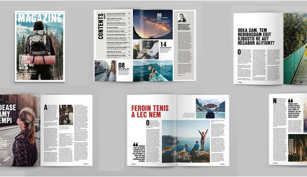
A magazine has several pages and if you choose to design each page individually, you would end up exhausting all your energy and time. Create multiple pages so that your magazine does not look uniform or boring in all the pages. You may consider creating one master layout for the first page of a feature and another master page for the textual content lying in between the features. Include elements such as background, page numbers, and the margins, which would in turn promote consistency. You would surely not want the page numbers to appear in different spots in different pages.
Experiment with colors
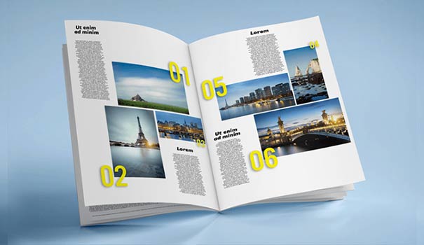
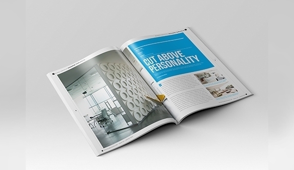
Focus on making the master pages colorful and engaging. Readers are more likely to look through brighter-looking magazines than through white text-based publications. Use of appropriate colors would help you set the tone of particular articles in an issue and you should think about the various ways you can use different colors. You can highlight feature pages with patterned backgrounds or by including a photograph at the background. You may also highlight the headline and the body with different colors. You may also highlight images with bright-colored borders.
Introduce contrast to improve visual appeal
Magazine Spreads
When you add contrast to magazine layouts, you add a life to layouts. You can add contrast to the layout in multiple ways. You can add fonts that look different, but complement each other perfectly and do not fight with each other for space or better attention. You can even use colors to add contrast. For example, you can use a bright background color for a feature page to make it stand out from the rest of the article pages. You may insert sidebars at different pages to highlight important lines.
Use multimedia to facilitate grand experiences
Consider adding multimedia in print as well as digital versions of the magazine. For the print versions, you should consider adding graphical elements such as illustrations, photography, infographics, and graphs that would help you describe stories in a more detailed and easy-to-understand way. When it comes to digital versions, you may adopt a more creative and interactive approach by including videos, audios, GIFs, and interactive quizzes. If you choose to use media that are used in print versions only, then you would miss out on the opportunities that digital publishing brings. In both versions photos plays a major role to attract the target customers.
It is advised to use reputed company to edit the magazine photos before you publish. Notably, in both the versions, photos play a major role in attracting the target customers. To ensure that you do it right the first time, it is advised that you use the services of a reputed photo editing company to get magazine photos edited before you publish them. They will provide professional photo culling services and select the best images to use in magazine.
Review your design
Look over all the pages to understand how your design appears in all the pages. You may take printouts to check if the designs of all the pages are in perfect harmony with each other. If you feel that everything is in balance, you should consider your magazine layout design project to be completed.
10 Critical Elements of Magazine Design
Designing magazine layouts may prove to be a really challenging task for a graphic designer if he/she is not aware of the 10 most important elements of magazine design and how he/she should use them in the most appropriate manner so as to create synergies out of their harmonious combinations.
Magazine Table of Contents
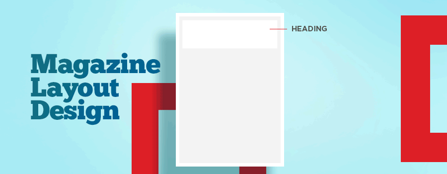
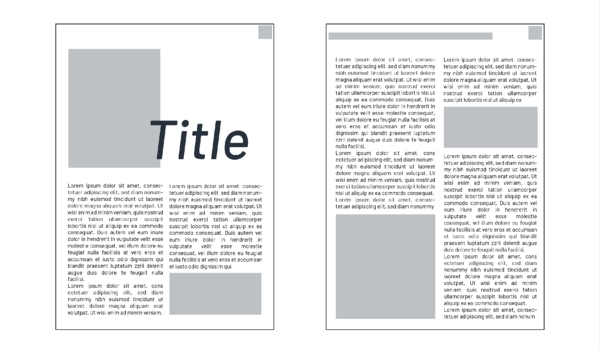
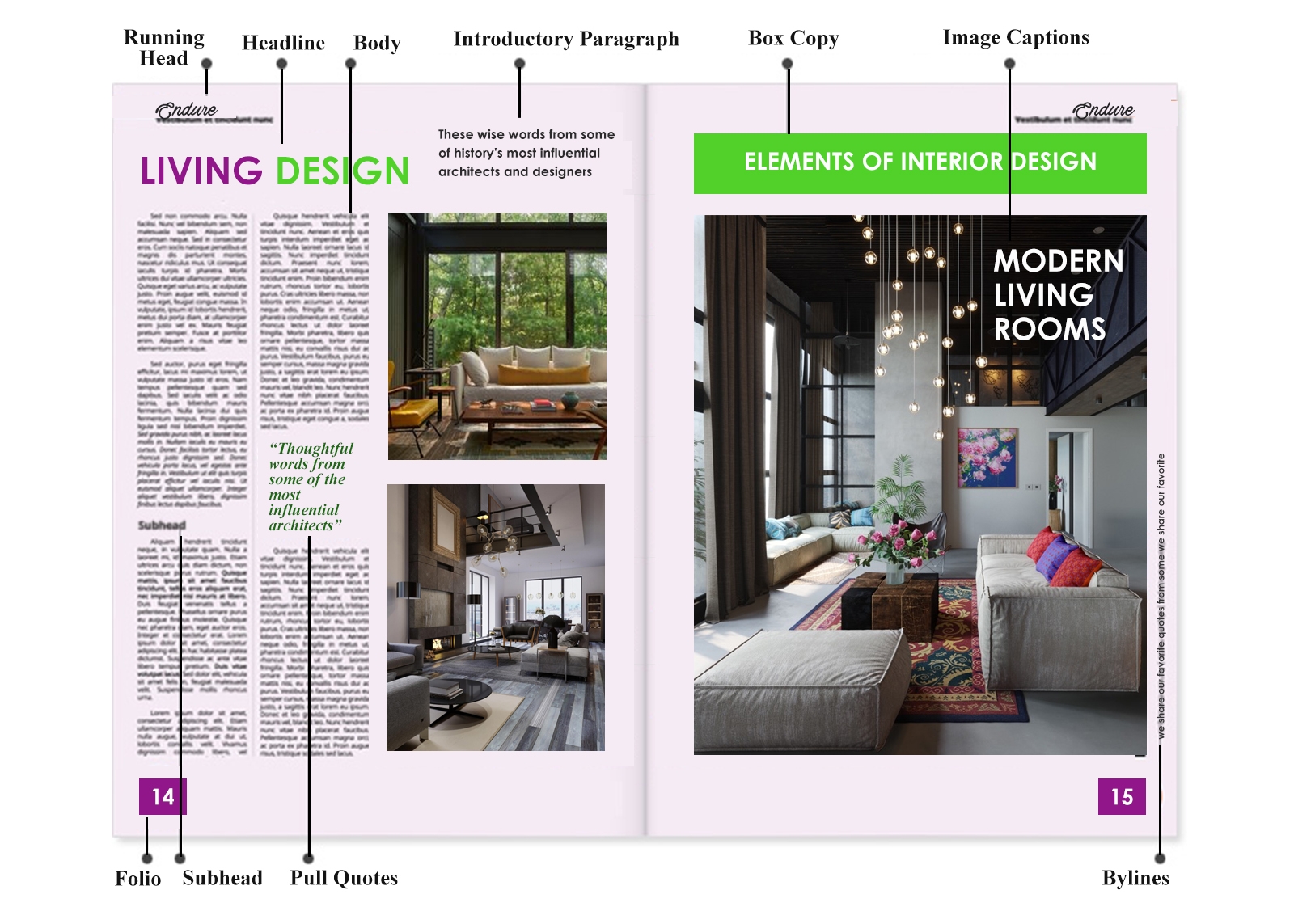
- Headline: Article headlines are the most critical elements of magazine design. Readers typically judge articles by the way their headings are presented. Headings should be typically larger than the body-text and should be meaningful and impactful enough to attract the attention of the readers.
- Preliminary Paragraph: Introduction, also known as ‘kicker’ or ‘stand-first’, is the initial piece of content that introduces readers to an article’s actual content. Introduction complements the appeal of the heading, keeps the readers’ interest levels high, and provokes them to read the entire article. The introductory paragraph determines the tone of the article and sometimes even serves as an article summary. This portion should either have bigger fonts than the rest of the article or it may be highlighted with bolder fonts as well.
- Body Text: The body text is the main part of the article and it discusses about the article topic in greater detail. Well-written articles can engage readers very well and influence them to buy different issues of the magazine again and again. When you start designing the magazine layout, you should start with the design of the body text because it occupies the maximum space and runs through several paragraphs. Focus on improving readability by adjusting the rows and columns in an appropriate manner. Make sure that the length of the body text is almost similar in all the articles.
- Bylines: Byline is the line that appears below the article headline. Bylines usually carry the article writer’s name. You can allow the fonts of the bylines and the body texts to have fonts of the same size.
- Sub-headings: Sub-headings separate an article into multiple sections and allow readers to get an idea of what they should expect in the consequent paragraphs. Subheadings may be presented using the same font as the body text, but you should highlight them appropriately to make them stand out from the rest of the text. Keep sub-headings bold to give them the appearance of mini-headings. Avoid putting sub-headings below quotes or images.
- Pull Quotes: Pull quotes make articles look interesting. Quotes allow for a better expression of stories especially if they are clubbed with images. You may either select a portion from the body text itself or you may choose to rephrase certain portions of the body text and present it as an excerpt or a quote. The font that you use to present pull quotes should be different from the font that you use to present the body text.
- Image Captions: Write image captions in a way that they complement the look and feel of images. Captions should be placed below the image and should describe it properly. The font size of the body text and the image caption can be the same or else, you may choose to use font that is a bit smaller than the font of the body text.
- Running Headings: You may not need to work on running headings in all magazines, but some magazines definitely need running headings. Running headings appear at the top of all pages of a magazine and allows readers to smoothly navigate through the magazine. Put more emphasis in designing your running headings creatively because your readers see them more frequently and so they need to be visually appealing.
- Folio: Folio refers to a way of arranging sheets of papers by folding them in particular ways. A folio should be designed in such a way that readers do not get irritated while looking at it in all pages. You should exercise proper care when you need to work on a magazine that features full bleed images. You may end up annoying readers if you put folios on pages that contain full bleed images.
- Panel: Also referred to as ‘box copies’, panels contain important facts on the topic of an article. These are facts that a reader should know and these would keep readers more engaged. Information that is included in the boxes has very short length and the facts usually appear in the form of statistics or dates or small pieces of information. These boxes should be placed strategically in the layout so as to grab the attention of the readers. You may choose to give every box a specific heading.
Pro tip: Consider hiring a typesetting service provider to take care of typographic issues.
The process of designing magazine layouts demands graphic designers to put their creativity to their best possible use. Today, the advent of various graphic design technologies has been allowing graphic designers to apply a modern approach to magazine designing.
Top 5 Magazine Layout Design Software
The use of advanced magazine layout design software can help you create awe-inspiring digital magazines featuring intricately-designed layouts. Well-designed layouts would allow you to organize your thoughts in a logical sequence, allowing users to pay more attention to the more important content and get easy access to the information that they are looking for.
We have listed the top 5 magazine layout design programs that would allow you to create custom and visually-appealing magazine layout designs:
FlipHTML5
FlipHTML5 is one of the most widely used magazine layout design maker and notably, it is a completely free program that users can effectively explore to design extraordinary magazine layouts. With this software, you can get plain PDFs converted into interactive digital magazines while being able to instill the page flipping effect as well. The software allows for customization and enables users to change the toolbar setting, background images, and digital contents including slideshows, images, videos, audios, etc. Additionally, you would be allowed to manage your digital booklet in the platform’s FlipHTML5 homepage. This would facilitate social media promotions as you would be allowed to distribute your booklets through email and social media or through your blog or website. You can also get your booklets downloaded in flipbook or PDF versions.
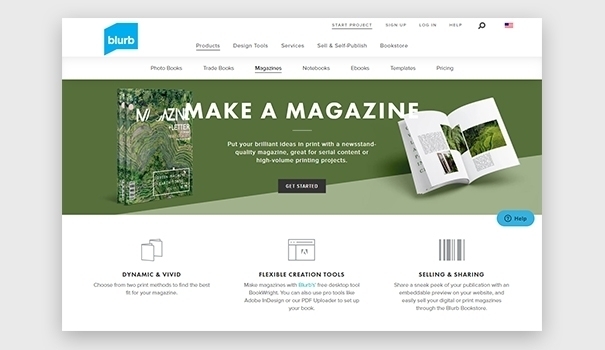
Blurb facilitates the creation of extraordinary print as well as digital versions of magazines, Ebooks, and photo books. The platform offers a collection of downloadable templates that you can customize to suit your specific needs. The platform facilitates magazine distribution as well.
iStudio Publisher
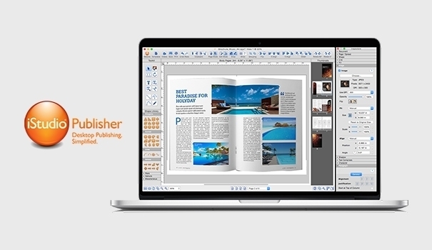
Mac users can optimally use iStudio Publisher, which can generate intuitive page layouts. You may either choose to start with a blank page or you may readily make use of one of the professionally-designed templates. Experts as well as novice users can use this software easily and create stunning magazine layouts.
Adobe InDesign
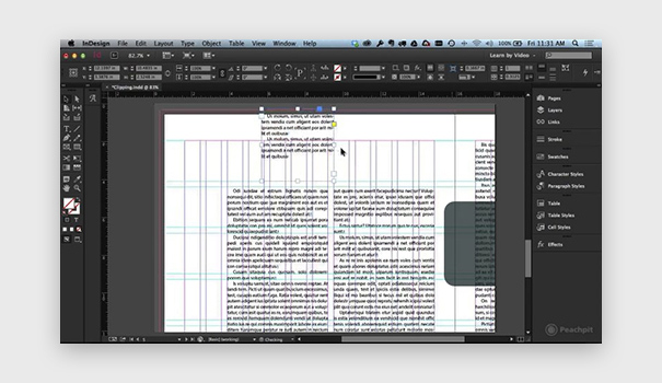
Adobe InDesign is one of the most famous and powerful programs that graphic designers make use of. Though powerful, InDesign is complicated and would demand continuous practice. Graphic designers can make the best use of the most advanced features of InDesign to create elegant page layouts for catalogs, newspapers, and magazines in digital as well as print versions. The software is supported by several operating systems such as Windows and Mac and it can even be used on Linux with a few adjustments.
QuarkXPress
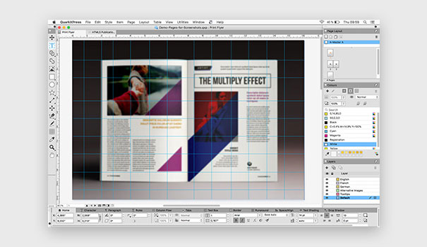
With QuarkXPress, you can create complex page layouts in WYSIWYG settings. This program is compatible with Windows and Mac OS X and allows for the addition of multiple layers in the PDF document and adjustment of their transparency. You can even get your project published in multiple languages including German, Chinese, Portuguese, Japanese, Korean, Portuguese, etc.
These 5 magazine layout designing software can be used optimally to create impressive and elaborately detailed magazine layouts. You may consider starting the process with FlipHTML5 because it is free for use and because it has some really powerful features. In fact, it is the most cost-effective option for startups to design magazine layouts.
Some of the best magazine layout design ideas
Awesome creative design outcomes are based on inspirational ideas. A good magazine layout has a perfect balance of text, images, sidebars, and columns. Creating your own unique magazine layout may seem to be a challenging task, but your job would become much easier if you consider looking at some really great designs and then combine your own ideas with the ones that you like the most in those designs. We thought of sharing a few stunning examples with you so that you can get some inspiration for your next creative design project.
- Adventure Digital
If immersive editorial photography forms the core essence of your magazine, you should give more importance to imagery while designing the layout. The magazine of “Adventure Digital” features a template that allows for the displaying of images at the front and center and striking a perfect balance between the imagery and the text sections. Readers can enjoy long scrolling and so you can add long-form content to the template. - Aficionado
Horizontal layouts were typically avoided previously by traditional publications on account of convenience issues. However, with the advent of eReaders and tablets, designers are focusing more on the creation of horizontal templates. In the e-magazine of “Aficionado”, we would find horizontal templates where columns have either divided the page into half or they have been pushed to one side or even eliminated to accommodate photographs or breathable white space. - Azure
The specialty of “Azure” magazine lies in the degree to which it can be customized in terms of color. It features bold fonts and blocky columns, which improves readability and allows the designer to experiment with color combinations. Creating high contrasts between the background and the texts is the key to drawing the attention of the readers. With the use of appropriate colors, you can positively impact the psychologies of the readers. - Connoisseur
The magazine of “Connoisseur” is based on a layout that features colored portions to segregate each page. This design works both vertically and horizontally, thereby allowing readers to enjoy close-up views of delicious delicacies. The layout includes diversified formats with columns being placed creatively to highlight photography. - Introspective
The layout design of this magazine points towards the importance of minimalism. A perfect combination of space and contrast, this magazine’s layout creates a strong appeal among the readers. The layout is glorified through the use of black-and-white photographs and fonts, which add a classic look and feel to it. This layout supports the inclusion of rich media such as videos to create a richer reading experience. - Money Fake
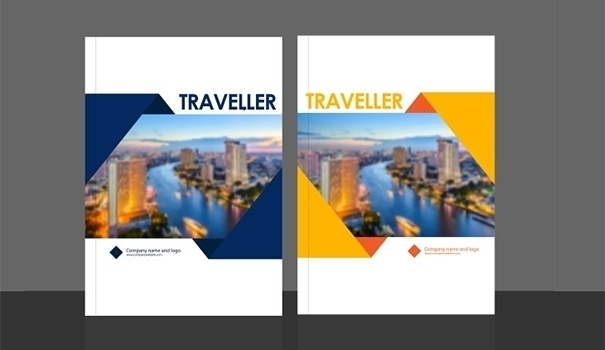
The magazine of “Money Fake” is an example where creative designers can experiment a bit with the conventional cover layout. This is based on the tried and tested formula with a large portrait being placed at the front and center and being encircled by captivating teasers of articles that lie inside. It also features details such as the date and issue number and a UPC code below. - New Yorker Business
This magazine’s layout is a predominant combination of black and white, but it also features a dash of vibrant red, which adds a stronger emphasis. Its specialty lies in its art-deco touches and thin font. Check out the extensive white space in the single-column layout, which contains scrolling text having a single quote highlighted on both the sides. - On the Road
The magazine layout of “On the Road” features several elements that you may like. For example, you would find pages with white borders, which would remind you of the era of Polaroid photos. You would find the juxtaposition to be quite fascinating and this would provide you with a narrowed view, thereby fueling your imagination. - Open Air
The layout of this magazine provides a lot of opportunities to include large background photos. The content blocks are pushed a little bit away from the margins to add a feeling of depth. The pages appear realistic and make users feel as though the content glides on the scenic panoramas. This design suits scrolling columns and it is in fact a key feature of digital magazines. - Seasons Digital Magazine
The layout of this classic magazine is a classic example of sophistication and detailing. It features elegant content that is horizontally aligned and generates a feel as though the content actually appears on a screen. The combination of serif copy with sans-serif headers creates a stylish presence by bringing traditional and modern styles together.
We hope that by now you have been able to understand the key aspects of magazine designing. If you want to share your concerns or ideas with us, do write to us and we would be happy to discuss further.